
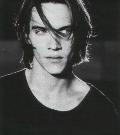
 First thing to start with is a reference photo. I really don't recommend trying to draw realistically without some sort of reference, whether that is a photo or even a real-life model (bowls of fruit anyone?). It helps to go ahead and crop/resize it to the size of your oekaki canvas. By the way, the picture I'm using here as an example is one of my very early oekaki pics, but I think the basics are covered even if the final result isn't spectacular.
|
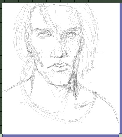 I used a 1 pixel watercolor to make my initial sketch in layer 0. Rather than just trying to start in one place and work around, I prefer to sketch the whole picture out and get everything lined up. Notice I also marked out where some of the shadows will be. I used a 1 pixel watercolor to make my initial sketch in layer 0. Rather than just trying to start in one place and work around, I prefer to sketch the whole picture out and get everything lined up. Notice I also marked out where some of the shadows will be.
|
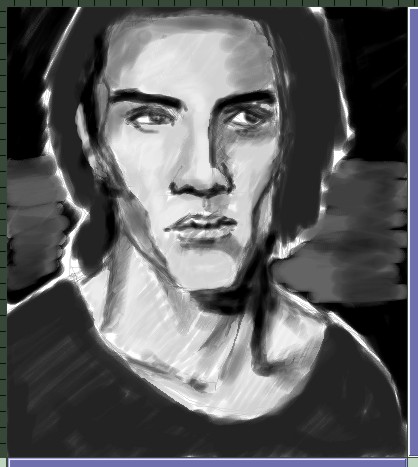 Here I've roughed in all the basic shapes, all right on top of the sketch. You can either work in the foreground or background layer, although the watercolor tool tends to be smoother when used in the bg layer. The idea is to build from the bottom up, working from areas of less detail down to more detail. I've found the best way to work with the watercolor tool is to get a good basecoat down first, so turn the A up to around 240-245 so it covers well. Don't worry about being too exact at this point...just get all the shapes in the right place. Here I've roughed in all the basic shapes, all right on top of the sketch. You can either work in the foreground or background layer, although the watercolor tool tends to be smoother when used in the bg layer. The idea is to build from the bottom up, working from areas of less detail down to more detail. I've found the best way to work with the watercolor tool is to get a good basecoat down first, so turn the A up to around 240-245 so it covers well. Don't worry about being too exact at this point...just get all the shapes in the right place.
|
 Now it's time to tighten up the details. I started with the eye here, but it doesn't really matter where you start. The main thing to keep in mind is to work from the bottom up, so the skin is a good place to focus on first. If you do something like the hair first, then you have to work around any place there's overlap--if two objects overlap, do the one on the bottom first. I don't jump into 1px watercolors right off the bat; use the largest brush size you can, then work in from there. Also, if you work tightly zoomed-in (something I usually don't do until I have to get the really fine details) make sure you zoom out and look at the whole picture often. Don't get lost in the details! Now it's time to tighten up the details. I started with the eye here, but it doesn't really matter where you start. The main thing to keep in mind is to work from the bottom up, so the skin is a good place to focus on first. If you do something like the hair first, then you have to work around any place there's overlap--if two objects overlap, do the one on the bottom first. I don't jump into 1px watercolors right off the bat; use the largest brush size you can, then work in from there. Also, if you work tightly zoomed-in (something I usually don't do until I have to get the really fine details) make sure you zoom out and look at the whole picture often. Don't get lost in the details!
|
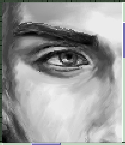 Speaking of zooming in, here's a shot of the eye detail. You can see the texture and brush strokes in the skin here as well...if you want a very smooth, almost airbrushed texture, blur will be your best friend. However, for this pic I went with a more painterly look and didn't touch the blur at all. To blend, hold the cursor over a point where two shades overlap and right-click. It samples a shade in-between the two and then you can use it to blend. This is a necessary technique to learn in order to advance beyond simply slopping down some shading and relying completely on the blur to smooth it out. Speaking of zooming in, here's a shot of the eye detail. You can see the texture and brush strokes in the skin here as well...if you want a very smooth, almost airbrushed texture, blur will be your best friend. However, for this pic I went with a more painterly look and didn't touch the blur at all. To blend, hold the cursor over a point where two shades overlap and right-click. It samples a shade in-between the two and then you can use it to blend. This is a necessary technique to learn in order to advance beyond simply slopping down some shading and relying completely on the blur to smooth it out.
|
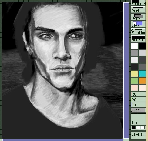 Here I've advanced a bit further, and also you can get a shot of my setup. I mixed all the shades just by eyeballing the original photo for this pic, but with the newer versions of PaintBBS there is a grayscale palette you can use...I still recommend mixing your own shades, but that can give you something to start from. Some people also open the reference pic in Photoshop or some other program and sample colors from there, then get the RGB numbers so that they can match them exactly. Here I've advanced a bit further, and also you can get a shot of my setup. I mixed all the shades just by eyeballing the original photo for this pic, but with the newer versions of PaintBBS there is a grayscale palette you can use...I still recommend mixing your own shades, but that can give you something to start from. Some people also open the reference pic in Photoshop or some other program and sample colors from there, then get the RGB numbers so that they can match them exactly.
|
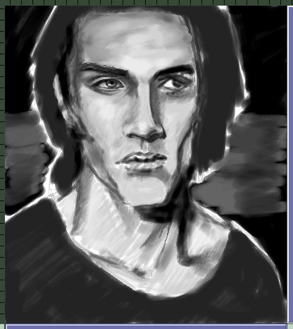
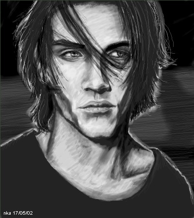 The finished version. The finished version.
|